How to Visualize Data Using Matplotlib
Edition #112 | 17th Mar 2025
Hello!!
Welcome to the new edition of Business Analytics Review!
Have you ever stared at a spreadsheet crammed with numbers and felt your brain hit a wall? I know I have. That’s where data visualization swoops in to save the day, turning those rows and columns into clear, compelling stories.
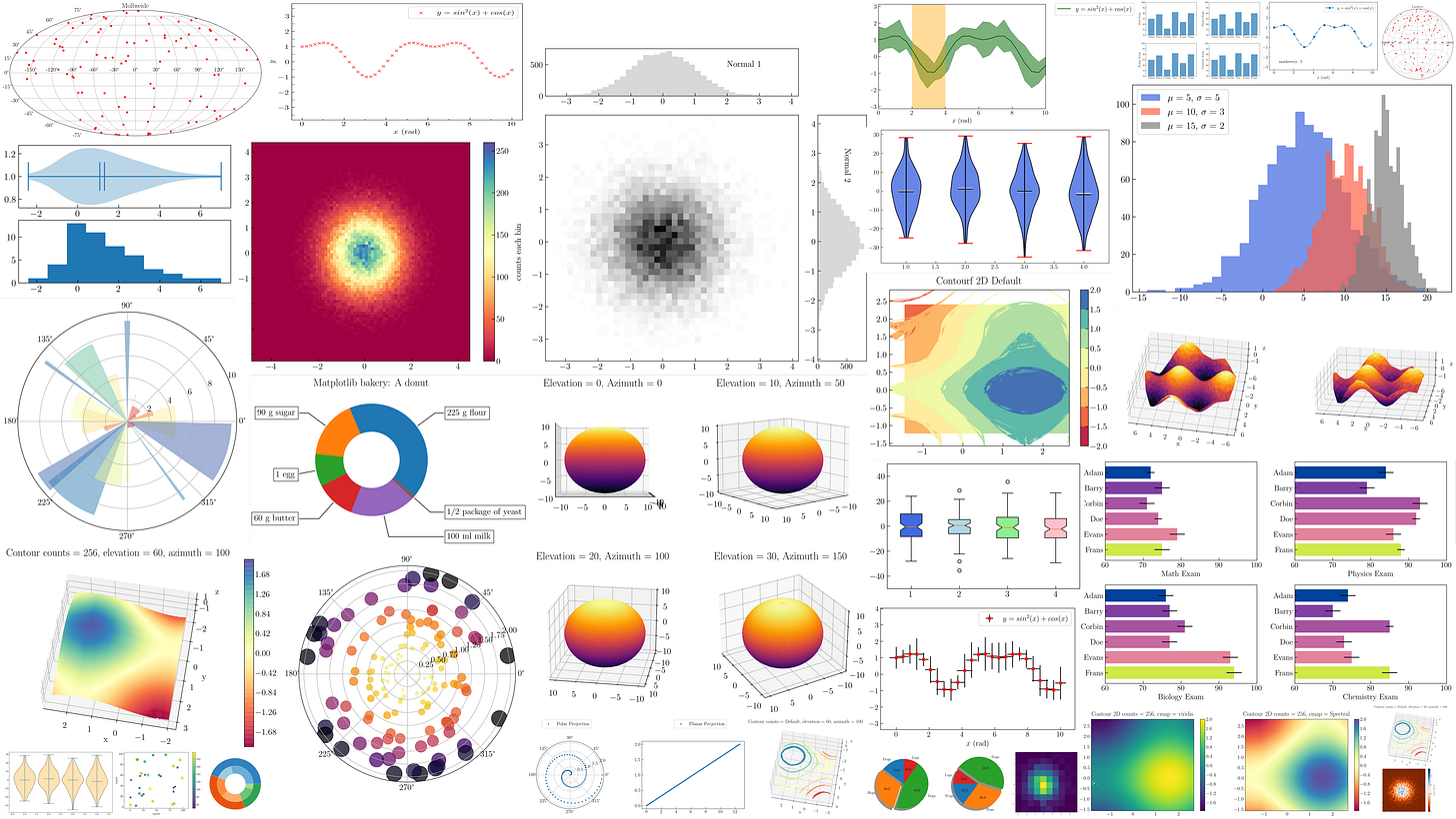
Today we’re diving into Matplotlib, a Python library that’s been a game-changer for data scientists everywhere. Whether you’re exploring datasets or showcasing your latest model’s performance, Matplotlib helps you see the big picture—literally. Let’s unpack why it’s such a must-have tool and how it can spark insights in your AI and ML journey.
Why Matplotlib Matters
Picture this: you’ve just trained a machine learning model, and you’ve got a pile of metrics staring back at you. How do you make sense of it? Matplotlib steps in like a trusty guide. It’s a Python library that lets you whip up everything from simple line graphs to intricate 3D plots, making your data not just understandable but downright engaging.
In the world of AI and ML, where complexity is the name of the game, Matplotlib shines by:
Uncovering patterns: Spot trends or oddities in your datasets with a quick scatter plot.
Tracking progress: Plot your model’s accuracy over time to see if it’s learning or just pretending to.
Sharing insights: Turn raw numbers into visuals that wow your team or clients, no PhD required.
Fun Fact: Matplotlib was born in 2003 when John Hunter needed to visualize brain data for epilepsy research. Now, it’s a go-to for millions, proving great tools often start with real-world problems!
What Makes Matplotlib Special?
Matplotlib isn’t just another plotting tool—it’s a Swiss Army knife for visualization. Here’s what sets it apart:
Versatility: From bar charts to heatmaps, it’s got a plot for every occasion.
Customization: Tweak colors, labels, and styles to make your visuals pop.
Team Player: Pairs perfectly with NumPy, Pandas, and Jupyter Notebooks for a seamless workflow.
Community Love: With tons of tutorials and a huge user base, help is always a click away.
Quick Example: Imagine plotting your model’s accuracy over training rounds. With a few lines of code—like plt.plot(epochs, accuracy)—you’ve got a clear line graph showing whether your model’s on track or veering into overfit territory. Simple, yet powerful.
Harness the Power of Verified US-Based B2B Data
LimeLeads offers fresh B2B contact data with 98% email deliverability and verified phone numbers. Get the most reliable sales leads today! Trusted by hundreds of customers from F500 brands to small businesses.
Get Started
Getting Started with Matplotlib
Ready to give it a spin? Here’s how to jump in:
Install It: Run pip install matplotlib in your terminal—easy peasy.
First Plot: Try plt.plot(x, y) to draw a basic line. Hit plt.show() to see the magic.
Make It Yours: Add a title with plt.title("My First Plot") or label axes with plt.xlabel().
Level Up: Explore subplots or animations as you get comfy.
Anecdote: I once helped a friend visualize her bakery’s sales data with Matplotlib. A quick line plot revealed a holiday spike she’d never noticed—cue a new marketing plan and some very happy customers. Data viz isn’t just for techies; it’s for anyone with a story to tell!
Dive Deeper: Recommended Reads
Want more Matplotlib mastery? Check out these gems:
“Matplotlib Tutorial: Python Plotting”
A hands-on intro for beginners.
https://www.datacamp.com/tutorial/matplotlib-tutorial-python“Top 50 Matplotlib Visualizations – The Master Plots”
A treasure trove of 50 plots with code for the adventurous.
https://www.machinelearningplus.com/plots/top-50-matplotlib-visualizations-the-master-plots-python/“Data Visualization with Matplotlib”
Advanced tricks for ML pros.
https://realpython.com/python-matplotlib-guide/
Latest AI News
“Foxconn to Post Higher Q4 Profit on AI Server Demand”
Foxconn’s betting big on AI servers, with profits up 2.35% this quarter.
https://www.reuters.com/technology/foxconn-post-higher-q4-profit-ai-server-demand-2025-03-13/“SoftBank, OpenAI to Build AI Data Centre in Japan”
A new AI hub’s coming to Osaka, powered by SoftBank and OpenAI.
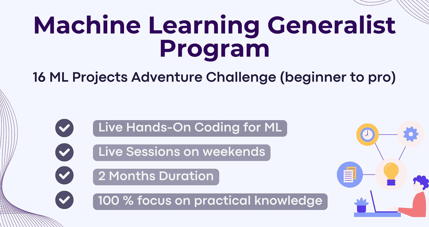
https://www.reuters.com/technology/softbank-openai-jointly-run-ai-agents-ex-sharp-lcd-plant-osaka-nikkei-reports-2025-03-13/Business Analytics Institute is offering Machine Learning Generalist program
The program offers live, hands-on coding experience through 16 live session, transforming participants from beginner to advanced mastery https://businessanalyticsinstitute.com/machine-learning-generalist/
Tool of the Day: Julius AI
To complement your Matplotlib journey, consider Julius AI, a trending AI tool in 2025 for data analysis and visualization. Accessible at Julius AI, it offers features like chatting with your data, creating graphs, and building forecasting models. It’s designed to enhance data-driven decision-making, making it a valuable addition for data scientists and analysts. This selection was informed by reviewing AI tools for data visualization, ensuring it aligns with the newsletter’s audience and current trends.
That’s our Matplotlib adventure for this month! What’s your favorite plot type—scatter, bar, or something wilder? Drop me a note—I’d love to chat. Catch you next time for more AI and ML goodness!
Warm regards,
Business Analytics Review
Learn how to develop a Chatbot for Customer Support using LangChain in one of the projects; Create an AI-Powered Legal Document Search & Much More…
To apply for scholarship, reach us at - vipul@businessanalyticsinstitute.com


Stunning designs, to add a story to the data!